I've seen too many writers that look like professional hobos rather than writers. Everything I've been reading lately say that professionalism is in short supply in our industry, and that those who do deliver a professional image are the ones that land regular assignments, become favorites of editors, and make more money.
As part of this series, I'm revamping and polishing all of my own marketing materials, and I'm starting with my headshot.
 Version 1 - "Come Hither Eyes"
The original headshot was pulled from an engagement photo. It was in black and white, and it was alright. (I guess. My mother referred to it as "a coy pose", and I can't quite get past my scandalous "come hither" eyes.)
While it served alright as a basic headshot, I don't think it projected the professional image I was looking for.
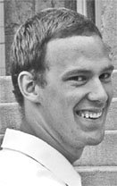
Version 2 - The Snapshot

Finally deciding I needed something (anything!) different, I borrowed my sister in law's digital camera, and had my wife snap a quick picture in front of our bookcase.
When compared to the earlier picture, Version 2 had some automatic advantages:
1. It was in color. Don't ask me why, but I find it harder to connect with a black and white picture.
2. The shot is straight on.One of my peeves about Version 1 was that I wasn't turned toward the camera. I won't explain the psychological body-language explanation behind it, but Version 1 sent the wrong signals because it was of me looking over my shoulder. It just didn't quite click with what I wanted. This is much better.
Unfortunately, this was the image pulled right off the camera. It's better, but it's also pretty rough. When scaled down, it gives me some funky bags under my eyes. It looks far too casual. Basically, the problem is that it looks like a snapshot, because it is a snapshot. Enter Version 3.

At long last, I have taken five minutes to recrop this picture in photoshop, and have actually managed to produce a decent looking headshot. In color, no less.
While not perfect, the final cropped version is a significant improvement over the original. It's simple and direct. I think it gives the impression I was going for. What do you think?


1 comment:
A little constructive criticism:
1. You might want to consider a plain background. The books/DVDs are too busy, especially since you're wearing a striped shirt.
2. Your face is slightly out of focus while your background is in focus. This happens with my digital camera all the time too.
You're on the right track though. You have the a friendly look on your face. You look trustworthy and smart. So that's good!
Post a Comment