Showing posts with label Look Like A Pro. Show all posts

4/20/07

Business Card Resources

Now that we've finished our look at Headshots and Author Photos, the Look Like a Pro! series turns it's attention to business cards. Listed here (in no particular order) are a variety of helpful links to learn more about why you need a business card, and how to get one.

Marketing guru Scott Ginsburg on Business cards that suck

The other day I was sifting through about 1000 business cards I've collected over the years. I noticed a few things that frustrated me… (More)

More from Scott Ginsburg – “Here’s My Card – Oh wait, I don’t have one…

Have you ever missed out on a business opportunity because you didn't have a business card? (More)

Freelancers on Business Cards

Absolute Write forum discussion about business cards:

Thread 1

Thread 2

'Renegade Writer' Linda Formichelli on business card options

A potential client asks for your card. What do you do?

A. Pretend to search through your pockets and tell the client you must have forgotten them.
B. Pull out a jazzy four-color illustrated card that unfolds and displays a pop-up image of your smiling face. Hey, it cost a bundle, but it takes money to make money, right?
C. Hand the client a homemade business card — dot matrix print on perforated white cardboard. Clients like thrifty freelancers!
D. Hand the client a tasteful business card that looks pricier than it was.

Read the correct answer and learn about affordable printing options here!

Dr. Ivan R. Misner, from the book “It’s in the Cards!”

Here’s the bottom line: this amazing little tool, this tiny advertisement that keeps working and working, is the most cost efficient promotional device you can own. A simple, elegant, classic business card can lend you and your business an air of quiet professionalism for only a few cents.

Free business cards, just pay shipping - Vista Print


4/5/07

One last example: Photos

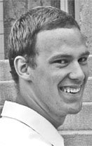
This is professional:
This is not. Unless of course, you're a professional clown... an unappealing clown.

My Mugshot Makeover!

Look Like a Pro! - Personal Makeover, Phase 1

I've seen too many writers that look like professional hobos rather than writers. Everything I've been reading lately say that professionalism is in short supply in our industry, and that those who do deliver a professional image are the ones that land regular assignments, become favorites of editors, and make more money.

As part of this series, I'm revamping and polishing all of my own marketing materials, and I'm starting with my headshot.

Version 1 - "Come Hither Eyes"
The original headshot was pulled from an engagement photo. It was in black and white, and it was alright. (I guess. My mother referred to it as "a coy pose", and I can't quite get past my scandalous "come hither" eyes.)


While it served alright as a basic headshot, I don't think it projected the professional image I was looking for.

Version 2 - The Snapshot
Finally deciding I needed something (anything!) different, I borrowed my sister in law's digital camera, and had my wife snap a quick picture in front of our bookcase.

When compared to the earlier picture, Version 2 had some automatic advantages:

1. It was in color. Don't ask me why, but I find it harder to connect with a black and white picture.
2. The shot is straight on.One of my peeves about Version 1 was that I wasn't turned toward the camera. I won't explain the psychological body-language explanation behind it, but Version 1 sent the wrong signals because it was of me looking over my shoulder. It just didn't quite click with what I wanted. This is much better.

Unfortunately, this was the image pulled right off the camera. It's better, but it's also pretty rough. When scaled down, it gives me some funky bags under my eyes. It looks far too casual. Basically, the problem is that it looks like a snapshot, because it is a snapshot. Enter Version 3.

Version 3 - The headshot

At long last, I have taken five minutes to recrop this picture in photoshop, and have actually managed to produce a decent looking headshot. In color, no less.

While not perfect, the final cropped version is a significant improvement over the original. It's simple and direct. I think it gives the impression I was going for. What do you think?

3/29/07

Look Like a Pro: Interview with writer Susan Johnston


As part of the Look Like a Pro! Series, I’m proud to present the very first (of hopefully many) Writer Spot Interview. I’ll probably come up with a catchier title than that, but that’s beside the point.

Today’s interview features freelance writer Susan Johnston, better known to some blog readers as the Urban Muse. Her website was recently highlighted as an example in personal branding by JibberJobber, a site specializing in networking and marketing yourself.

On to the interview!


You were recently named JibberJobber's Pick of the Month for March. What has that been like?

I'm flattered. It has definitely boosted my daily traffic, but it's too soon to tell if those readers will become regulars.

Your website is relatively new; tell us a little bit about setting that up and working through Vista Print.

I logged onto VistaPrint to order new business cards and saw that they were offering a free month's trial of their web hosting service. After upgrading to the personal package to the basic business package, tweaking one of their templates and setting up a domain-based email, I was sold. No coding required and very friendly customer service.

Your 5Q's interviews have featured a number of highly regarded writing professionals. How has that helped you?

It's a win-win situation. The writers get to promote their books and other projects, and I get a virtual informational interview to pick their brains about publishing. It's also a draw for other aspiring writers who read my blog. I've even gotten free copies of books before they're available in bookstores (called galleys), which is great because I'm not making big bucks (yet).

Why did you decide to start a blog?

I was encouraged by one of my writing mentors, and it took off from there. She stressed that it's important to specialize, rather than trying to blog about everything and that advice has served me well.

The photos on your site look great. Were they done professionally?

Yes. I hired Rachel at Decent Urban Lifestyles (http://www.decenturbanlifestyle.org), and I think she did a fantastic job of highlighting my personality in a flattering and fun way without being too staged.

What led you to get your photos professionally done?

I'm also a semi-professional singer/actress and I needed new headshots. I met Rachel at a women's networking event and LOVED the photos on her blog and website. She does a great job of capturing life's little moments in unexpected ways. Plus, she's also trying to establish her photography business, so her prices were reasonable and I wanted to support an emerging artist. After I got my 8 x 10's printed in black and white, it occurred to me that I could do so much more with them, so I posted them on my website and use them anytime an editor requests a contributor photo.

Why did you choose to put your photo on your website and not your blog?

When I first started my blog, I wanted to be cautious about online safety and that was a clever way to show my personality without showing my face to potential predators. I know it sounds a little paranoid, but young women can't be too careful with that sort of thing. After a few months, I realized that wasn't as much of an issue as I'd expected, in part because my name is so common, but I stuck with the cartoon because it had become my "urban muse" alter ego. I chose photos because I wanted something more professional-looking for my website, which is where I send editors first.

Where did you get your first clip?

I think it was a book review in Teen Voices, a glossy magazine that helps teenage girls boost their self-esteem through writing. I also wrote for my junior yearbook and my high school and college newspapers, but I'm not sharing those clips on my website. Those were limited edition!

Do you have any advice for new writers that are just starting out?

Yes. If you really want to write for a certain publication, be willing to take on assignments that might not initially interest you, because it's important to build up your clips and build relationships with editors. Once you've done that you can afford to be choosier. But you may also discover that you like writing about the topic. I've written a ton of articles on entrepreneurship and personal finance. I love it, but it wasn't originally what I set out to write.

What, in your opinion, separates the professional writer from the amateur?

It's about attitude. A professional attitude means not making silly mistakes like forgetting to spell check and fact check or demanding that your editor put your article on the cover. It's also about knowing your worth as a writer and not accepting projects that don't benefit your overall goals as a writer. If you're not getting paid and the clips aren't very professional-looking, you need to take a look at why you're doing it. If it gives you personal satisfaction, that's great, but it won't help reach your professional goals.


I'd like to thank Susan for taking the time for this interview, and would heartily recommend that you check out her blog, The Urban Muse.


Source: Photo

3/28/07

You're only as good as your picture

This picture perfectly sums up anything I could say about why you need a good headshot. Look at the two, and ask yourself the following four questions:

Which picture is more professional?
Which is more likely to land an assignment and get paid more money for it?
Which one will have editors calling him with assignments?
Which photo do you want to be?

In a perfect world, you'd be judged solely on your writing ability. The world, unfortunately, is not perfect. In fact, even if it were, your picture would still come in to play.

When choosing between two writers of equal skill, an editor has to make decisions based on perceived intangible qualities, such as punctuality, dependability, and professionalism. One of these photos effectively communicates all of those qualities.

In a world where your picture can mean the difference between a paying assignment and a rejection, why would you put anything but your best foot forward?

Source: Photo

3/22/07

Photo resources

In the first post of the "Look Like a Pro!" series, I've rounded up some informative bits of advice from seasoned professionals, writers and non-writers alike. In addition to the talented and successful writers here, I've also found some useful information from real estate agents, publicists, entrepreneurs and web professionals. Enjoy!


Photo via Flickr
Inkthinker's Kristen King looks at the problem of unprofessional, overly glamorous head shots, and covers what a photo should say.

[Professional writers are] using their photos to further a point, to strengthen the message they're conveying with their site copy: "I'm classy." "I'm dependable." ... "I'm real." ...
They're all making writers in general look good by being professional and appropriate. So stop screwing it up! Take that glamour shot off your site and be a grown-up already.
You're better than that. We all are. (
More)

Publicist Joan Stewart weighs in on the necessity of a professional photo, and gives a few simple tips.

If a newspaper or magazine … called you today … would you have a good-quality photo that you offer?

Most people don't.

Many of the bad-quality photos I see are too dark, out of focus, grainy, scanned incorrectly, or taken against a busy backdrop—often by amateur photographers... One writer gave me a photo that shows him with his eyes closed. A woman gave me a photo of her in a sleeveless blouse, with her bra strap showing... (
More)


Longtime freelancer Patricia Fry gives the complete lowdown on using your photo for your website, published pieces and marketing materials.


Don't just ask a neighbor to take your picture while posing in the backyard. Put some thought into the image you want to portray and hire a professional to capture that image. Here are some guidelines to note when planning your photo shoot. (More)


Real Estate agents, like freelancers, also market and brand themselves. Real estate marketing consultant Jim Cronin chimes in on how your image impacts your professional pursuits.


If your headshot is unprofessional, then you look unprofessional. The world can be very superficial, and appearances do matter - people want to work with someone they feel looks "nice." (More)


Business columnist Penelope Trunk blogs about her own experience with a professional photographer.


I went without showering, I brought one, black, dirty shirt, and I had not slept well for weeks. I walked into the room and there were seven people there to take care of all the stuff I needed: hair, makeup, they brought clothes for me, they had a caterer, it was amazing. There was a person in charge of making wind blow my hair. And the photos were incredible. No one would ever know how crappy I looked. (More)


I recommend checking each post in full.

3/20/07

Look Like a Pro! (A Series)

In the next week or so, I will be in the process of reorganizing, revamping and otherwise sprucing up my personal marketing materials. As I do this, I’ll be detailing, step by step, what I’ve changed and how it’s better. I’ll be posting all of this information as a series, including all sorts of informational goodies for readers.

Some of the topics I’ll cover:
The Mug Shot - Why every writer needs to look sharp
The Portfolio - Putting your best foot forward with your best work
The Business Card - If you don't have a card, you might not exist
The Website - See above.
Building Your Personal Media Kit - Putting it all together into a professional Grand Slam.

I may include as part of this series interviews related to these topics. Do you know a lot about any of these areas? Drop me a line: BrianWestover[at]gmail.com

Any suggestions as to what else I should include would be appreciated.