4/20/07

Business Card Resources

Now that we've finished our look at Headshots and Author Photos, the Look Like a Pro! series turns it's attention to business cards. Listed here (in no particular order) are a variety of helpful links to learn more about why you need a business card, and how to get one.

Marketing guru Scott Ginsburg on Business cards that suck

The other day I was sifting through about 1000 business cards I've collected over the years. I noticed a few things that frustrated me… (More)

More from Scott Ginsburg – “Here’s My Card – Oh wait, I don’t have one…

Have you ever missed out on a business opportunity because you didn't have a business card? (More)

Freelancers on Business Cards

Absolute Write forum discussion about business cards:

Thread 1

Thread 2

'Renegade Writer' Linda Formichelli on business card options

A potential client asks for your card. What do you do?

A. Pretend to search through your pockets and tell the client you must have forgotten them.
B. Pull out a jazzy four-color illustrated card that unfolds and displays a pop-up image of your smiling face. Hey, it cost a bundle, but it takes money to make money, right?
C. Hand the client a homemade business card — dot matrix print on perforated white cardboard. Clients like thrifty freelancers!
D. Hand the client a tasteful business card that looks pricier than it was.

Read the correct answer and learn about affordable printing options here!

Dr. Ivan R. Misner, from the book “It’s in the Cards!”

Here’s the bottom line: this amazing little tool, this tiny advertisement that keeps working and working, is the most cost efficient promotional device you can own. A simple, elegant, classic business card can lend you and your business an air of quiet professionalism for only a few cents.

Free business cards, just pay shipping - Vista Print


4/17/07

Meme Break : My Favorite Type of Writing

After a crazy and hectic week between semesters (during which I got what I hope to be my last non-writing job) and a slight lag in posting, today's post actually isn't part of the Look Like a Pro! series. We'll return to our regularly scheduled programming tomorrow. The incomparable Susan Johnston over at The Urban Muse tagged me for the latest meme - "What's your favorite type of writing?"

What's my favorite type of writing? One might just as well ask, "What is your favorite writing to read?" In fact, I'll just address both questions, since the answers are the same.

I can claim no undying love for one specific style of writing. There is no genre that I attack with any more zeal than another. I do focus far more on light journalism and magazine writing, but that's more for practical purposes than anything else. If anything, I'd have to say that my favorite style of writing is high quality, regardless of the genre.

I've written absolute dreck in more than one style, and I've read even more. The sad fact is that writers are human, which means that at any given moment we may be lazy, frustrated, uninspired, untalented, or otherwise imperfect. Everyone has off days, even the best writers. For this reason, it is all the more magical to really be on, to deliver something great.

Great writing is far more than simple words. It has life to it, substance that extends beyond paper and ink. All writing communicates something, but the best of it has power. That's what I love, both to read and to write. Do I actually write that way? Probably not. I'm always learning more about the craft, improving my skills and as I do so, I look back at what I've done before and wonder "What was I thinking?"

And so, my own writing aspires to be my favorite writing. My favorite reading shows me just how marvelous my writing could be. The best stuff pops and sizzles, filling your mind with excitement the way a handful of Pop Rocks shows your mouth what it means to be alive. It's the mental equivalent of the tender steak, the hot shower, the runner's high or the first kiss. Great writing engages the reader and changes them forever.

Perhaps a piece will only allow the reader a few moments free of worry or stress, a brief escape from the dreary world. Perhaps the reader experiences the irreparable stretching of the mind that a powerful concept brings, forever changing how the world is seen. Either way, that single quality piece of writing is what all writing should be - a vibrant, expansive experience that goes far beyond the reading of words.

Tag, you're it!

The first three people to comment and post a link to their blog get the tag! Hurry! Comment now!

4/5/07

One last example: Photos

This is professional:
This is not. Unless of course, you're a professional clown... an unappealing clown.

My Mugshot Makeover!

Look Like a Pro! - Personal Makeover, Phase 1

I've seen too many writers that look like professional hobos rather than writers. Everything I've been reading lately say that professionalism is in short supply in our industry, and that those who do deliver a professional image are the ones that land regular assignments, become favorites of editors, and make more money.

As part of this series, I'm revamping and polishing all of my own marketing materials, and I'm starting with my headshot.

Version 1 - "Come Hither Eyes"
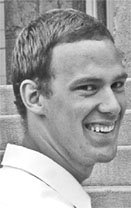
The original headshot was pulled from an engagement photo. It was in black and white, and it was alright. (I guess. My mother referred to it as "a coy pose", and I can't quite get past my scandalous "come hither" eyes.)


While it served alright as a basic headshot, I don't think it projected the professional image I was looking for.

Version 2 - The Snapshot
Finally deciding I needed something (anything!) different, I borrowed my sister in law's digital camera, and had my wife snap a quick picture in front of our bookcase.

When compared to the earlier picture, Version 2 had some automatic advantages:

1. It was in color. Don't ask me why, but I find it harder to connect with a black and white picture.
2. The shot is straight on.One of my peeves about Version 1 was that I wasn't turned toward the camera. I won't explain the psychological body-language explanation behind it, but Version 1 sent the wrong signals because it was of me looking over my shoulder. It just didn't quite click with what I wanted. This is much better.

Unfortunately, this was the image pulled right off the camera. It's better, but it's also pretty rough. When scaled down, it gives me some funky bags under my eyes. It looks far too casual. Basically, the problem is that it looks like a snapshot, because it is a snapshot. Enter Version 3.

Version 3 - The headshot

At long last, I have taken five minutes to recrop this picture in photoshop, and have actually managed to produce a decent looking headshot. In color, no less.

While not perfect, the final cropped version is a significant improvement over the original. It's simple and direct. I think it gives the impression I was going for. What do you think?